Mailchimp started as a web design agency, so you expect their website to be top-notch. And they do two things brilliantly:
👌 Most of the key information is within two clicks, and rarely more than three. It’s even more impressive now that Mailchimp is a large marketing suite, not just email marketing software.
💰 They show the most expensive plan first, which is a nod to enterprise customers but also a great price anchoring technique for small businesses.
Here’s how to model your funnels based on the Mailchimp website.
How Mailchimp goes beyond simple funnels
There’s a “3-click rule” doing rounds on the Internet, saying that everything should be within three clicks for the best user experience. This is a good indicator but you can create a 3-click experience that feels terrible to people.
Mailchimp often does it in less than three clicks.
But that's not what makes the difference. They combine it with other techniques.
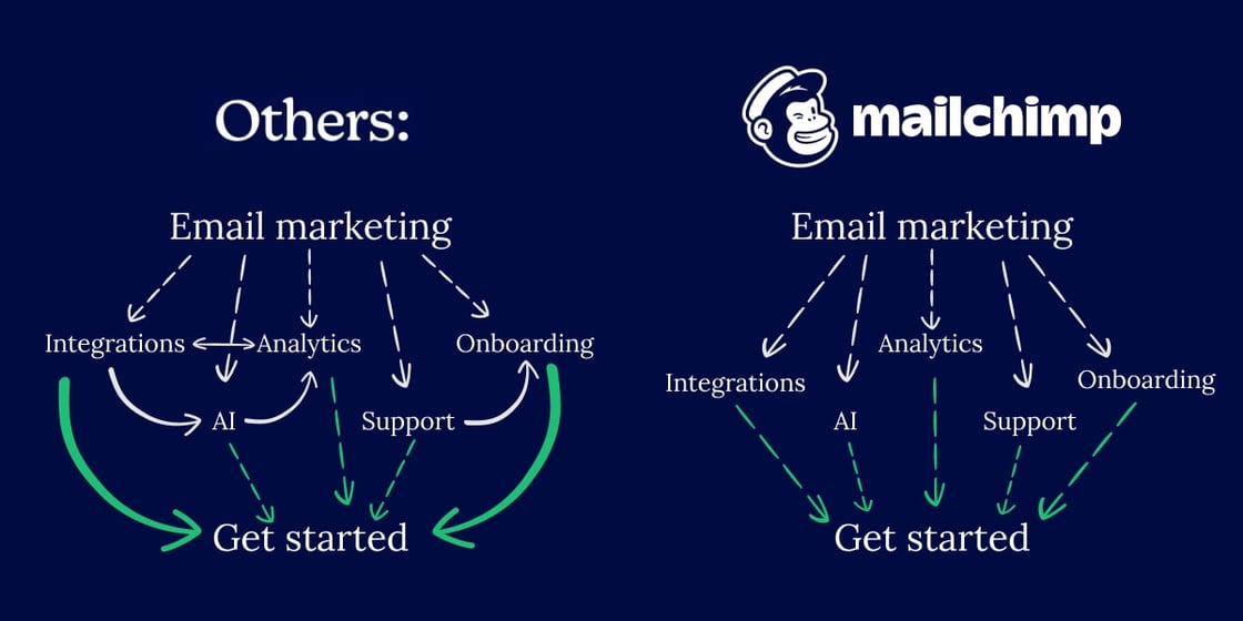
Mailchimp is great at avoiding traps in their funnel.
These traps pop up when you link between all loosely related pages from their content (the navigation doesn't count).
Loops like this can cause people to read the same page multiple times within one session without realising it. They cause frustration and prolong the user journey, often preventing people from converting.
Here’s an example of how most other sites design funnels, compared to Mailchimp:
When reading the "Integrations" page, you won't end up on "Analytics".
However, you can still find your way there by tracing back your steps.
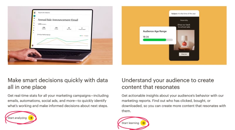
The second thing the nailed on the Mailchimp website are contextual calls to action. "Get started" and free trial offers are great for your hot leads.
People browsing features are a different story. They have different motivation.
Mailchimp provides them with natural and logical CTAs, like in this example:
A startup-friendly business takes on enterprises
In the first issue of Webabunga! about Stripe, we explained what they do to satisfy multiple audiences with unique needs.
“Mailchimp” and “enterprise” is a combination that was unlikely when the tool first came to life.
The company started as a web agency that has developed an affordable email marketing tool for their small business clients.
They went on quite the journey to an (almost) full marketing suite used by some of the biggest companies in the world.
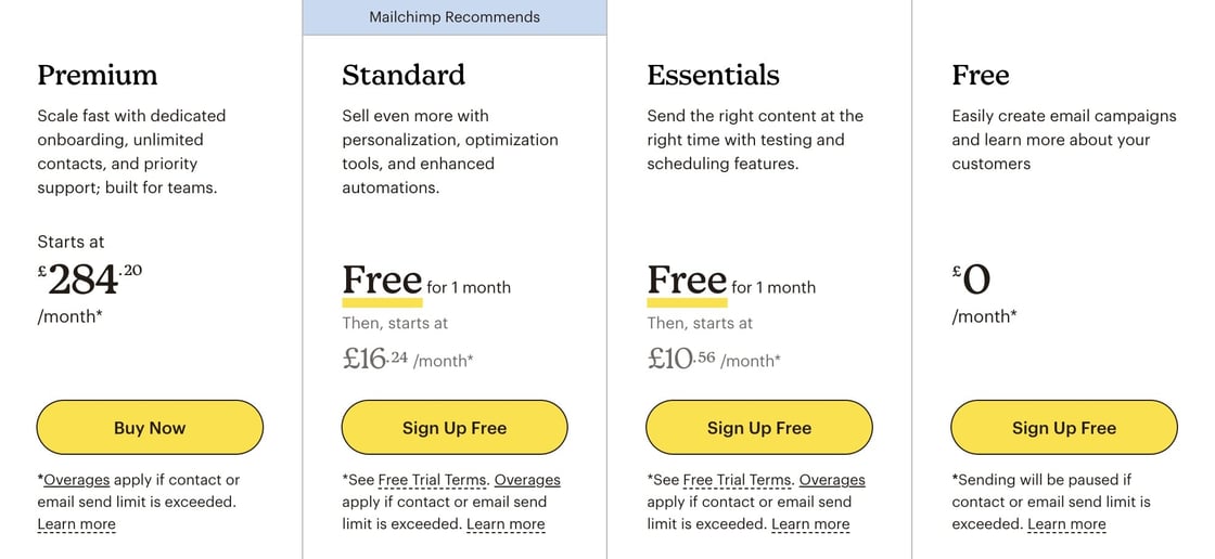
The one thing that stands out is how their pricing appeases to enterprises and small businesses.
Mailchimp's pricing is sorted from the most expensive option to the cheapest. This does two things:
For small businesses, this creates a price anchoring effect. A £10-16/month plan sounds like a steal knowing that others are paying up to 28 times as much.
Enterprise customers have a shorter user journey. It might not seem like much, and it might be an accidental benefit, but your option is first if you work for a large company.
It's a win/win for the micro businesses, which the culture at Mailchimp was built on, and for the large companies that use Mailchimp for more than emails.
Webabunga! aims to inspire you and your marketing team. If you've enjoyed this episode, please share it with colleagues by sending them this link.
Is there a great website you'd like to see in the second episode? Give them a shout by replying to this email and we'll pick the best ones for the future Webabunga! episodes.
Thanks for reading!
Tomasz Lisiecki
Tomasz oversees NerdCow's key focus on delivering innovative services for clients.
Lukasz Sieron
Lukasz assists with directing website development projects, writing clean and efficient code.
Dawid Zimny
Dawid ensures the steady progress of projects. He always stands ready to lend a hand.
Nerd Cow Ltd., 231 Shoreditch High Street, London, London E1 6PJ, United Kingdom, 0203 848 1661