Stripe solves three big problems of SaaS and tech companies in a relatable way:
Reducing dead clicks on product/software images. 👀
Convincing both the economic buyer AND the end-user. 🖥
Making truly user-centric landing pages by flipping the process on its head. 🙃
We spent 20 hours analysing their site and listening to the stories of Stripe's employees and executives.
Here are three things you have to steal from their landing pages.
The Stripe phenomenon: three things they taught us about websites
To understand the impact of Stripe’s website, we must understand their mission. Most people would say that Stripe “does payments”. In the best-case scenario, the answer is “they do financial technology”.
It’s puzzling why people would find a payment provider inspiring, or why that company would want to be inspiring in the first place.
There’s an easy explanation in Stripe’s mission. It has two powerful statements that show they’re much more than a payment processor:
Increase the GDP of the Internet and build economic infrastructure for the internet.
This puts their website in a different perspective.
But it also means that people misunderstand the source of inspiration.
Here are three things they do great as a SaaS & tech company.
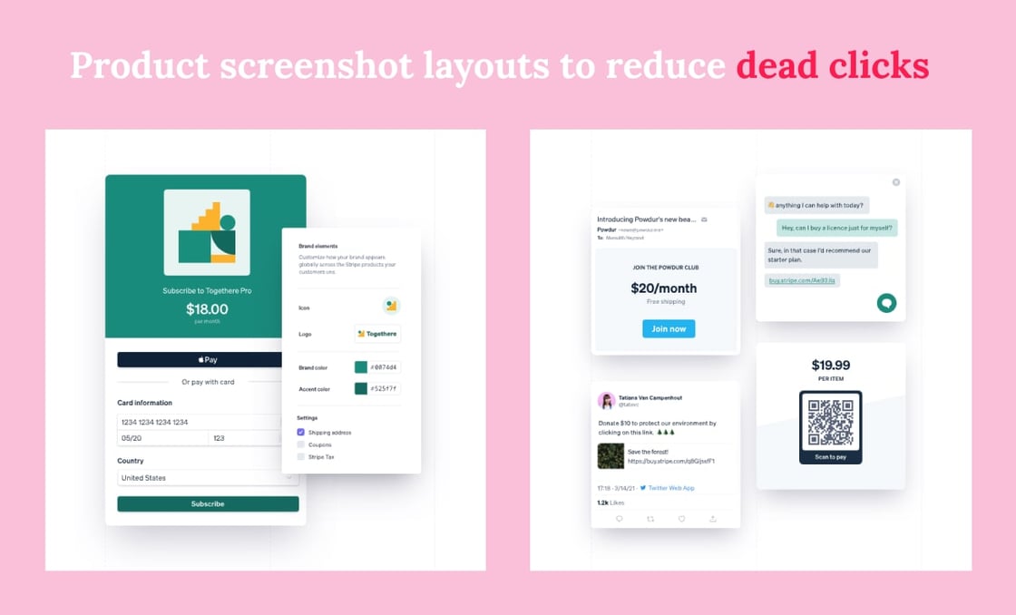
1. Fewer dead clicks on product images 👀
People love product screenshots.
Marketers hate them for the dead clicks they bring.
Sometimes even putting it inside a device mockup doesn’t help - visitors will try to interact with them anyway.
It’s always a bummer when you click something and it doesn’t react as expected. It seems like a minor inconvenience, but these issues compound over the entire visit.
Stripe solves dead clicks on product images using animations.
The best part? It's not as resource-heavy as it seems.
You don’t need to animate all product shots. Even Stripe doesn’t go all out. Once you set the tone with a few animations, people will get it, as long as you’re consistent. Avoid pages where all product images are static and you’ll be good to go.
What if you don’t have the resources to animate your product shots? There’s an easier solution, and one that Stripe uses for some of their images as well.
Instead of animating images, overlay different product screens. You can also put them in a grid, which will lead to fewer dead clicks.
2. Convincing the economic buyer & the end-user 🖥
There’s a ton of platforms with two audiences.
Airbnb and Uber are marketplaces where the audiences are unique.
For Stripe, the difference is more subtle. The audiences share ultimate goals, but their economic buyer is not the user.
Stripe started out marketing to web developers, who are the primary users - they implement Stripe’s software. This approach has changed over the years, but developers are still important.
How do they talk to both audiences?
They are completely open about it and don't try to hide that there are two audiences.
Developers have their own space in the navigation bar. It’s just as big as Stripe’s “Solutions” menu.
It’s safe to assume that, being tech-savvy, devs would find the information anyway. But Stripe shines a spotlight on it right away, which does two things:
Makes it easy for developers to find documentation.
Communicates to the economic buyer that “hey, this is more than just a corporate purchase - talk to your devs!”
What a way to make developers feel appreciated!
Technical information is also prevalent on landing pages. You’ll see snippets of code on the Home page. Stripe is not afraid that “it’s not relevant to the economic buyer” because you don’t need the content to be as hyper-focused as a targeted advertisement.
3. “Move with urgency and focus, but be meticulous”
This is a frankensteined quote from Patrick Collison, the CEO of Stripe.
Stripe does seven things to be truly “customer first”. Some of them are definitely a privilege of a $14B company, but it shows the philosophy that makes them successful:
The process of building a landing page is unique almost every time. It’s rare to see the same team twice.
By extension, the way they build pages is neither agile nor waterfall. It’s what the team finds best for that project.
Landing pages are a truly one-off project. Usually, they don’t involve a design system. This helps move with urgency.
There’s A LOT of scrappy prototypes of small parts. Every detail matters - be meticulous.
They use the “yes, and…” approach. The team rarely rejects ideas, but they also rarely take them at face value.
Many projects involve 10+ people to build one landing page. It’s not just to get it done faster. The large teams are diverse and help cover the wider user requirements.
The founders are enthusiastic about freaking cool web pages! The culture is always top-down and stakeholder buy-in makes all of the above possible - with great results.
And if you’re wondering about how meticulous it gets, here’s a prime example:
Webabunga! aims to inspire you and your marketing team. If you've enjoyed this episode, please share it with colleagues by sending them this link.
Is there a great website you'd like to see in the second episode? Give them a shout on X or LinkedIn with #webabunga, or by replying to this email.
Thanks for reading!
Tomasz Lisiecki
Tomasz oversees NerdCow's key focus on delivering innovative services for clients.
Lukasz Sieron
Lukasz assists with directing website development projects, writing clean and efficient code.
Dawid Zimny
Dawid ensures the steady progress of projects. He always stands ready to lend a hand.
Nerd Cow Ltd., 231 Shoreditch High Street, London, London E1 6PJ, United Kingdom, 0203 848 1661